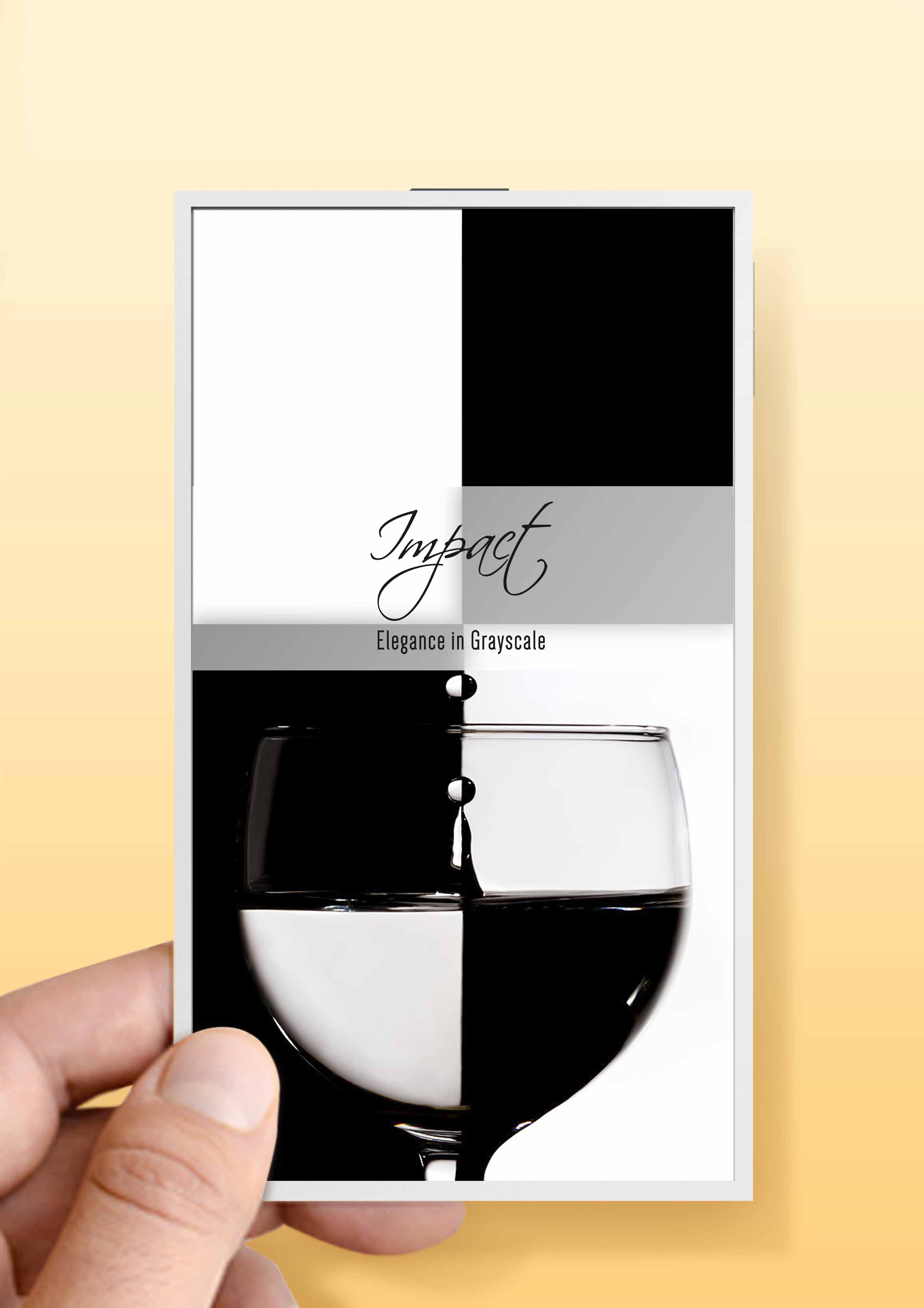
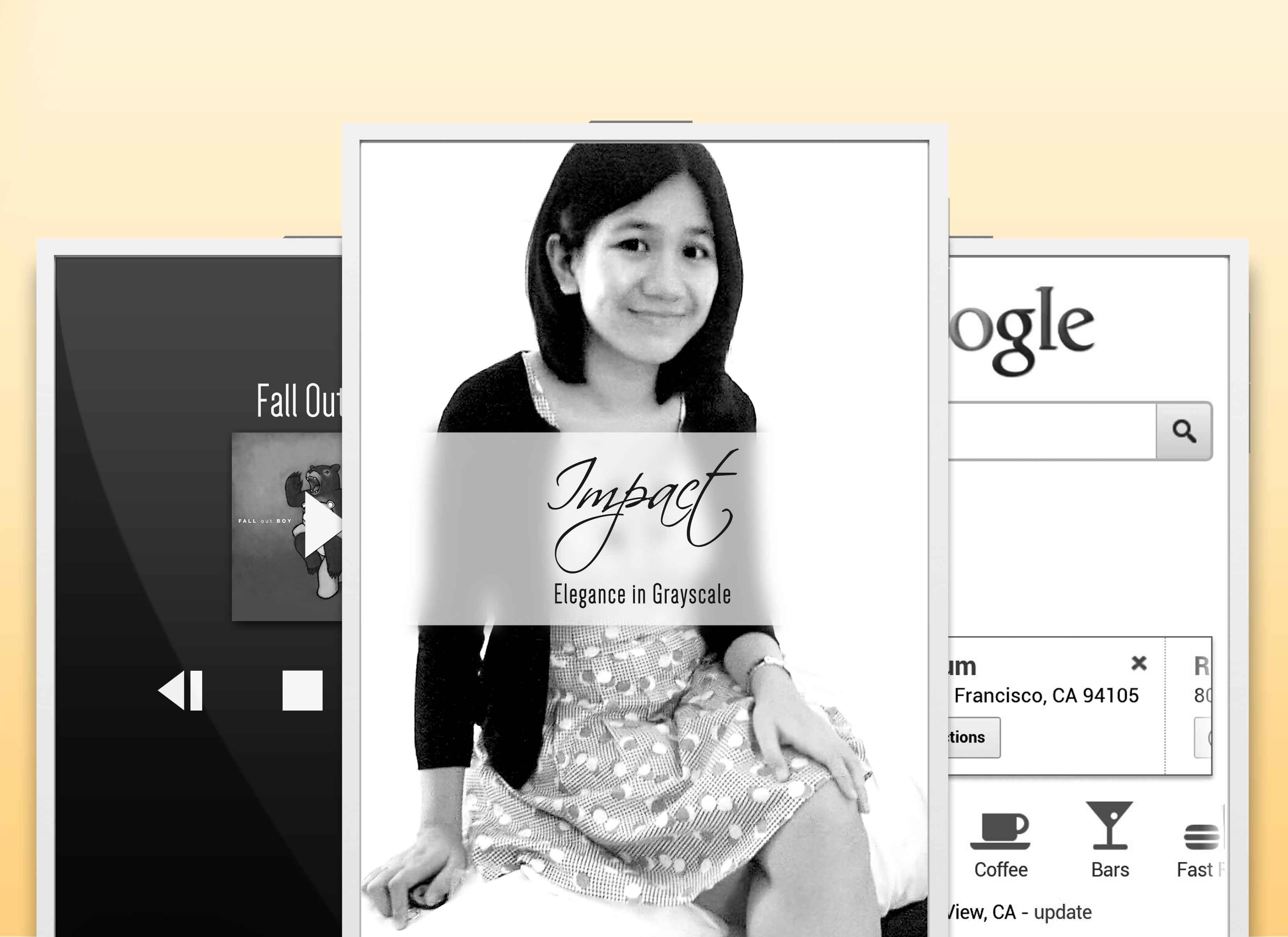
My first concept of a tablet – which, I’ll admit now, is void of colors except monochromatic grayscale. So just sit back and enjoy the elegance of grayscale.
*note: not to scale. Ok you can, since the foremost image portrays its scale.


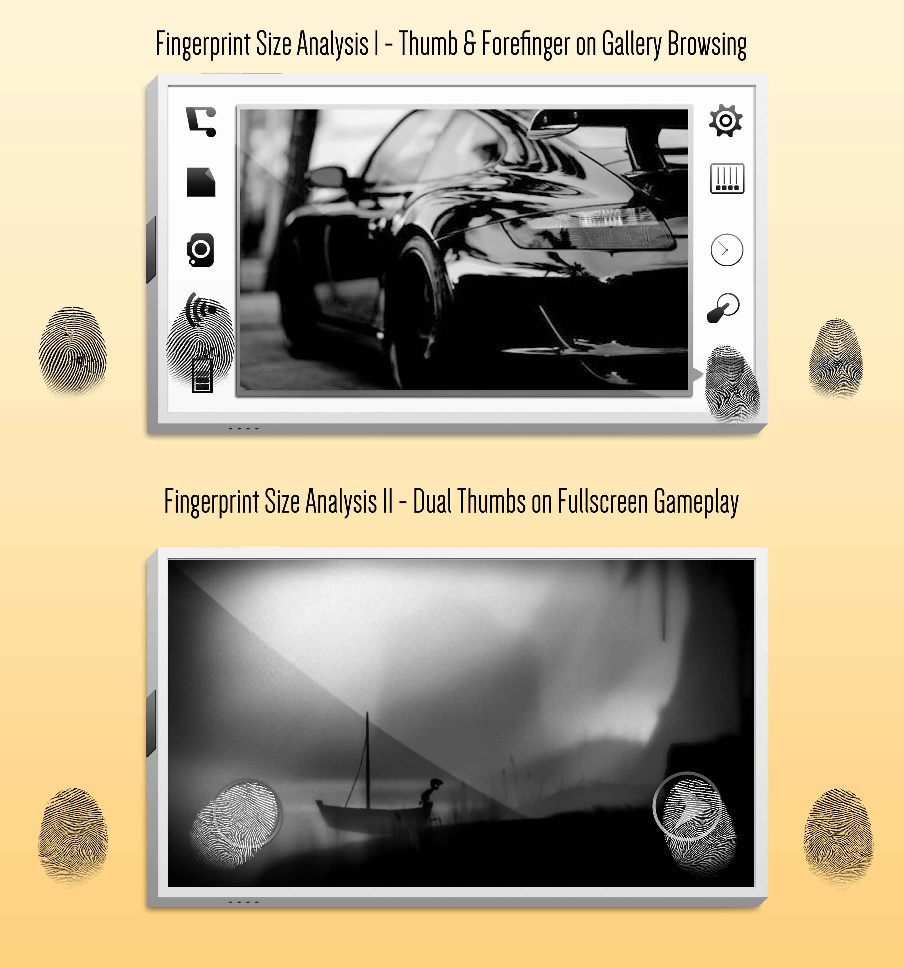
I really like Limbo, which I hope comes out as a pre/sequel for a mobile.

Ironically, although I’ve based the moniker of my mobile to the font, Impact – I just found no elegance in it, thereby changing the font I used for it while retaining the name. Now it has both the heavy-sounding name while retaining its elegance.
In the end, its a misnomer, with style.

Thank you! And I hope you don’t lose your love for grayscale.